What is Dark Mode? A Dark Mode is essentially a supplemental mode enabling you to showcase dark surfaces on the UI.
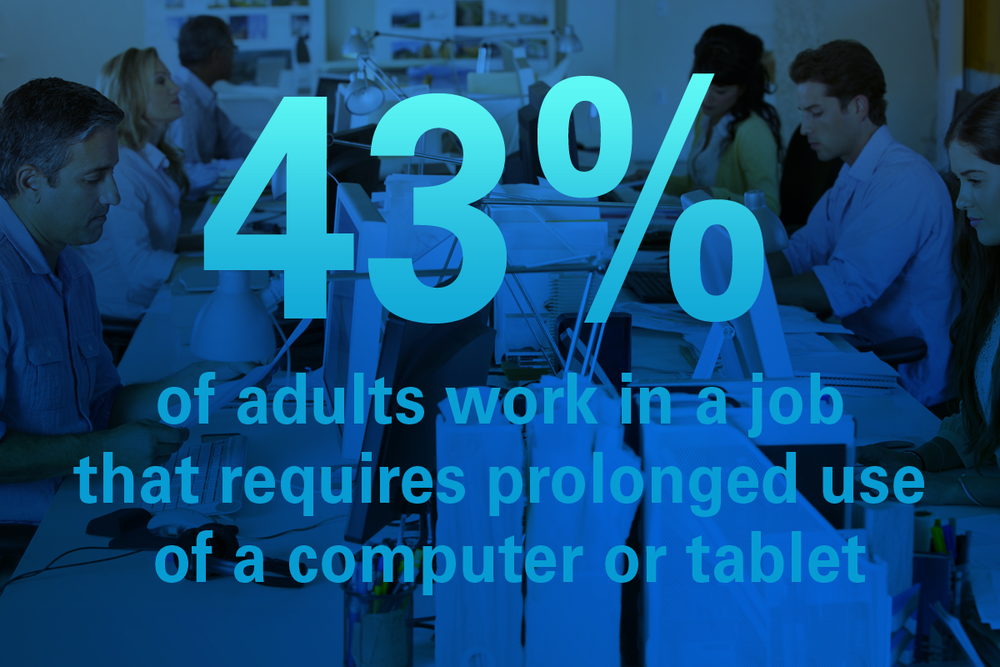
According to a report, an average person in the United States looks at his phone over 150 times in a day. So much of screen time from frequent mobile, computer and tab use can cause serious complications leading to eye strains and eye impairments.
It’s predicted that 2 out of every 3 Americans will experience eye strain caused by excessive phone use. This can lead to blurred vision, dry eyes, sore eyes, and headaches.
Keeping the stats in mind, big brands like WhatsApp, Facebook, Microsoft etc thought of implementing dark modes to their mobile and web apps to help users browse through their apps without affecting their eyes.
Here’s what they did:
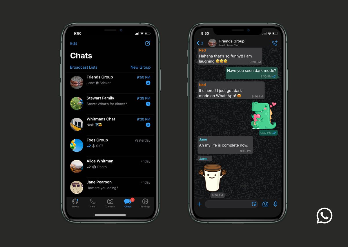
WhatsApp – WhatsApp dark mode for iOS is majorly in a combination of Black and Grey. For Android, it is close to Blue and Grey.
According to WhatsApp, they plunged into Dark Mode primarily to reduce eye fatigue and better match the system defaults on all operating systems.
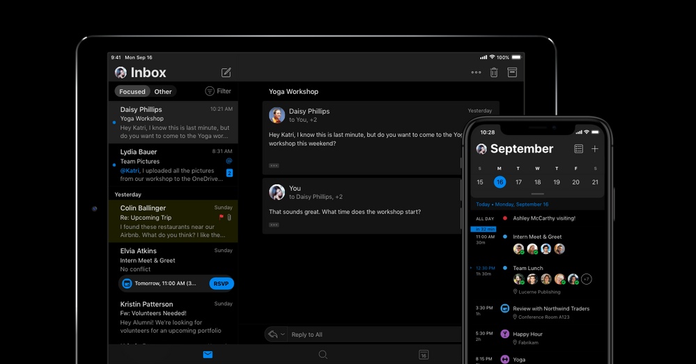
Microsoft Outlook – Microsoft was one of the snoopers who announced the launch of Dark Mode out of nowhere. They came up with an update at the end of August.
Emails are stacked against a black backdrop intended to save battery.
Microsoft has no plans of limiting Dark Mode to just Outlook, they plan to come up with Dark Mode for Word, Excel, OneNote, PowerPoint, SharePoint, One Drive, Planner, and To-Do coming very soon.
Gmail – It was at the end of 2019 when Dark Mode was enabled for Gmail. The intent was to save battery while reducing eye fatigue while scrolling through your inbox.
The UI for Gmail is pretty similar to Google’s other Dark Mode apps. However, the app uses a dark grey background and not completely black which might affect battery optimization.
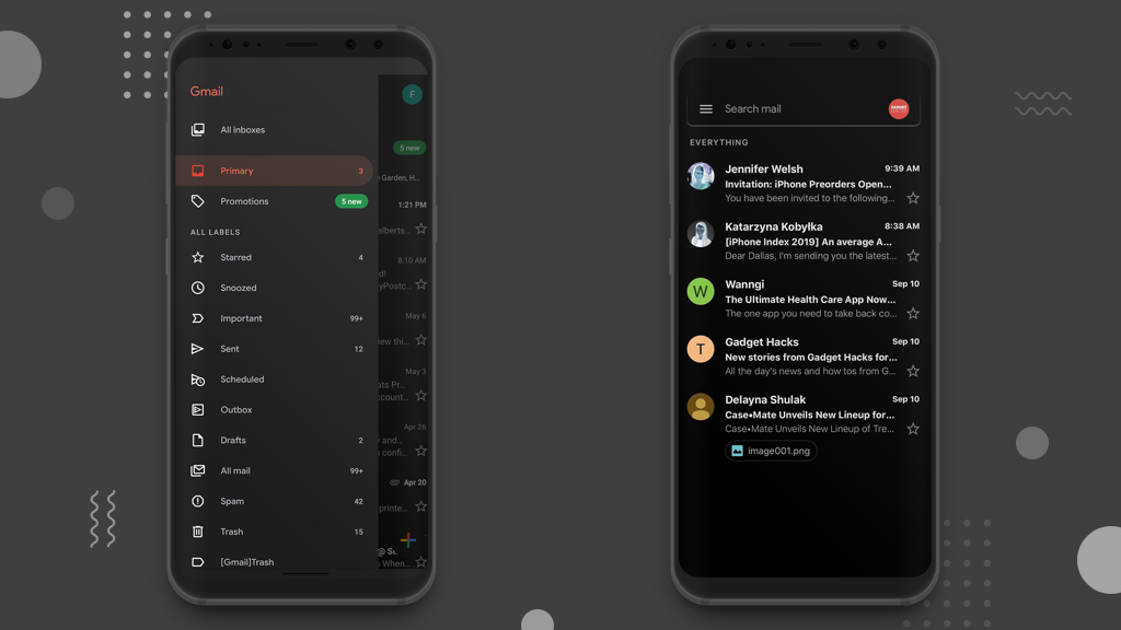
What does Dark Mode do? Dark Mode reduces the light that is emitted from the device screen. One of the primary benefits of using Dark Mode is that it enhances visuals by reducing strain and fatigue to the eyes. Dark Mode is designed to adjust itself as per the present light conditions which makes it comfortable for night and dark surroundings.
Another answer to what does dark mode do is that it saves a lot of battery life on the device, which makes it possible for users to be on the app for a longer period of time.
At RnF Technologies, we had a client who wanted us to build an eCommerce mobile app with Dark Mode enabled. We did it for them, and when they ran thorough checks in the beta version, our client was overwhelmed with the response.
Are you considering implementing Dark Theme in your next project? Great idea! Tell us your requirements and we will build the perfect app for you.
Wondering about the cost of developing a mobile app? Find out Now!
Note – Dark Mode themes can be enabled and disabled by using a toggle on the screen/settings.
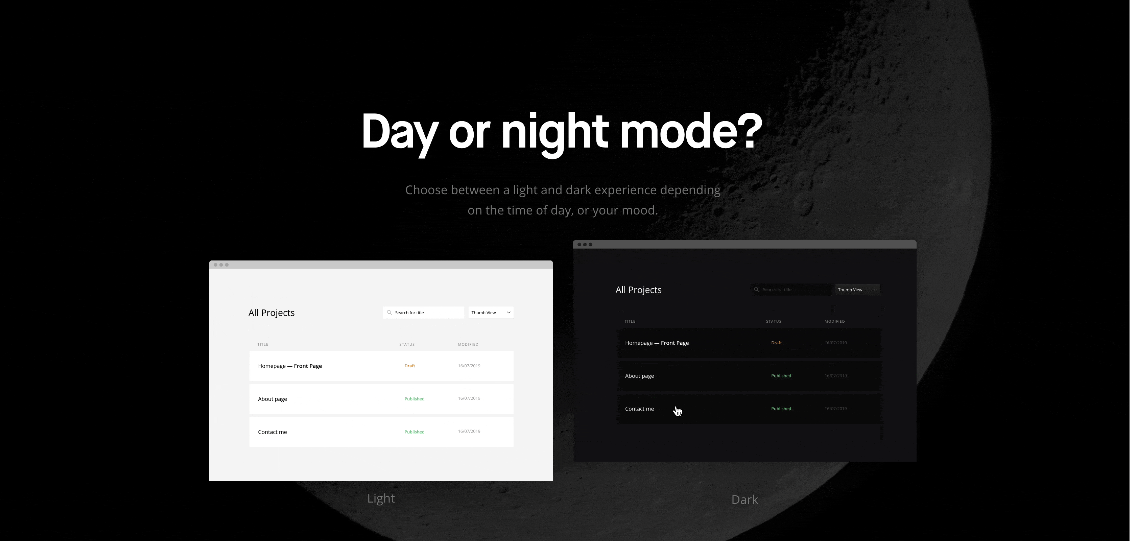
What is Dark Mode – Advantages and Disadvantages of Dark Mode
The dark theme comes with its share of advantages and disadvantages.
| Advantages of Dark Mode | Disadvantages of Dark Mode |
|
|
What is Dark Mode – Should You Implement Dark Mode to Your App?
If you ignore Dark Mode in this decade, you surely stand out in the crowd (in a negative way.) Today, a majority of the users prefer to use, if not use – at least have the option of enabling dark mode to the apps they use.
As a result, users expect apps with dark mode to be available. You absolutely do not wish to be the only app that is bright, right?
Android devices use Xcode and Android Studio in order to implement a set of assets for Light, as well as Dark Modes
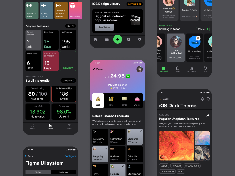
What is Dark Mode – Future of your App with Dark Mode
While we answer the question “what does Dark Mode do?”The entire purpose of enabling Dark Mode to your app is to enhance user experience. However, in order to capitalize on Dark Mode, it is vital to follow some rules while you are at it for your app.
Rules to Follow
- Follow the Platform Guidelines
Following the platform guidelines is vital when considering to create dark mode for your app. Google and Apple, both have rigid and thorough guidelines in place to help you implement dark mode to your apps. Make sure you comply with these guidelines. - 100 percent Black Screen – Avoidable
As per the recommendation by Material Design, #121212 is optimal for your Dark theme surface color, majorly because a completely black screen is considered to be tough on the eyes. Similarly, for the text, pure white is avoidable. Rather, Material Design suggests the use of Alpha (Material Design recommends 87% for primary content) to reduce disturbing contrasts. 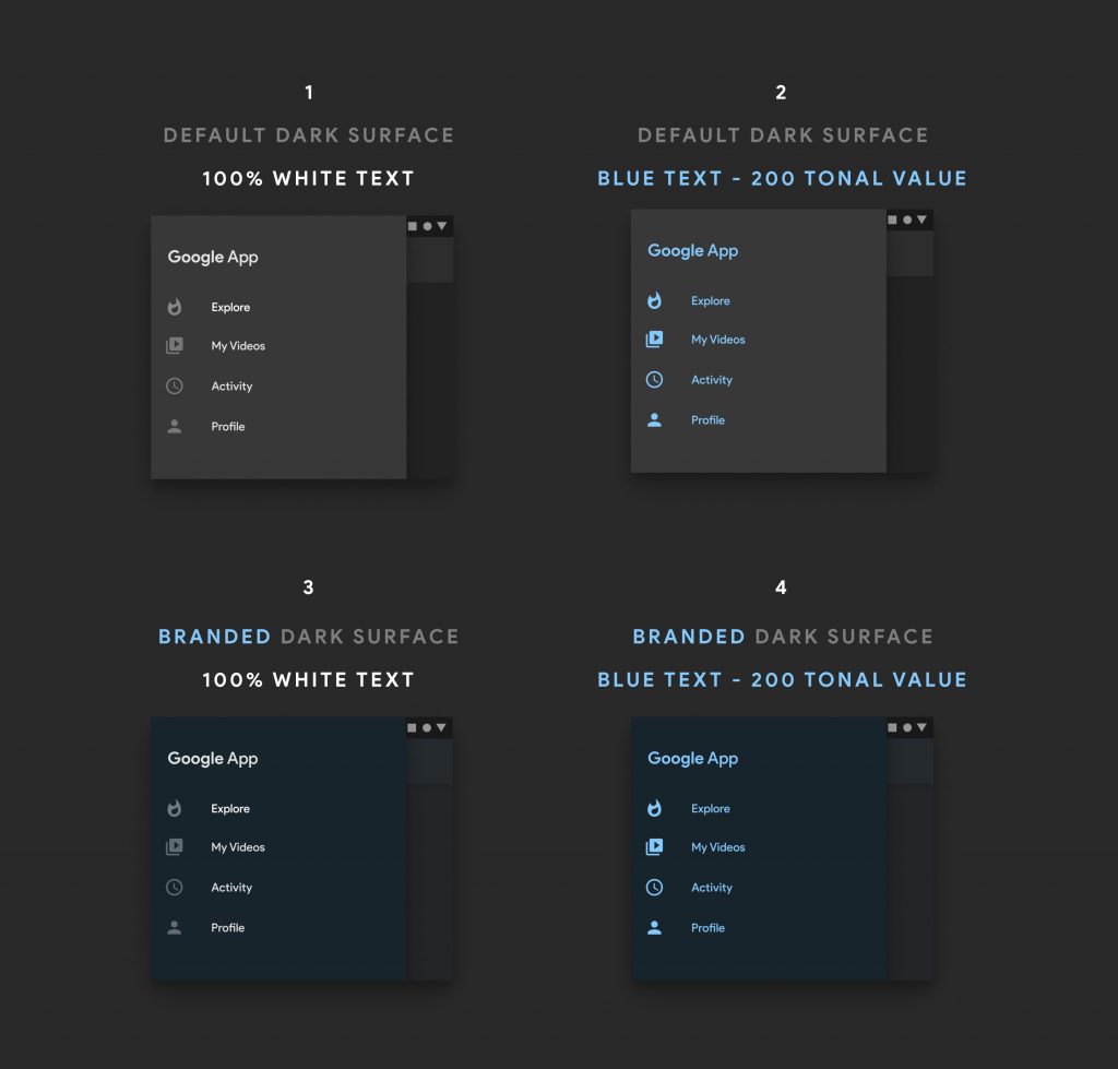 Source
- Elevation Brightness
Generally, in Light mode, you ought to make use of drop shadows in order to communicate visual hierarchy. However, when it comes to Dark Mode, this is completely avoidable. Instead, make use of different greys to differentiate various content on the page.
Shadows remain perceivable as and when the background gets lighter. For this reason, do not stop making use of shadows.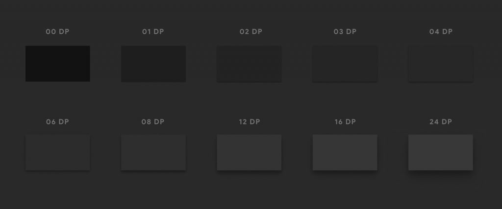
- Change Primary Color
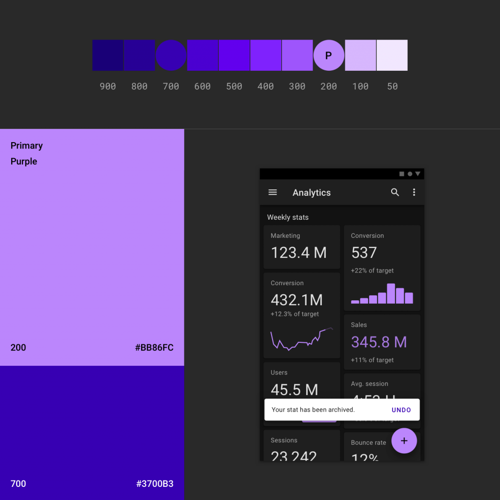
Make sure to avoid the use of saturated colors in Dark Mode as they have the potential to reduce readability. This is primarily because they are too bright. As per Google Material Design, it is optimal to use:- 500 color for Light Mode
- 200 color for Dark Mode
- Use Colors in Small Portions/Splash Screen
Colors primarily bring about more control in Dark Mode. Consider using that to your benefit by making some of your content pop. However, overuse of this is avoidable. Splash Screen is absolutely decisive because it is the first screen that your users come across when they open your app. You don’t want your users to go all eye hurting as soon as they open your app, right? It is imperative that your screen shows sufficient contrast so that it becomes easier to differentiate between different states of activities.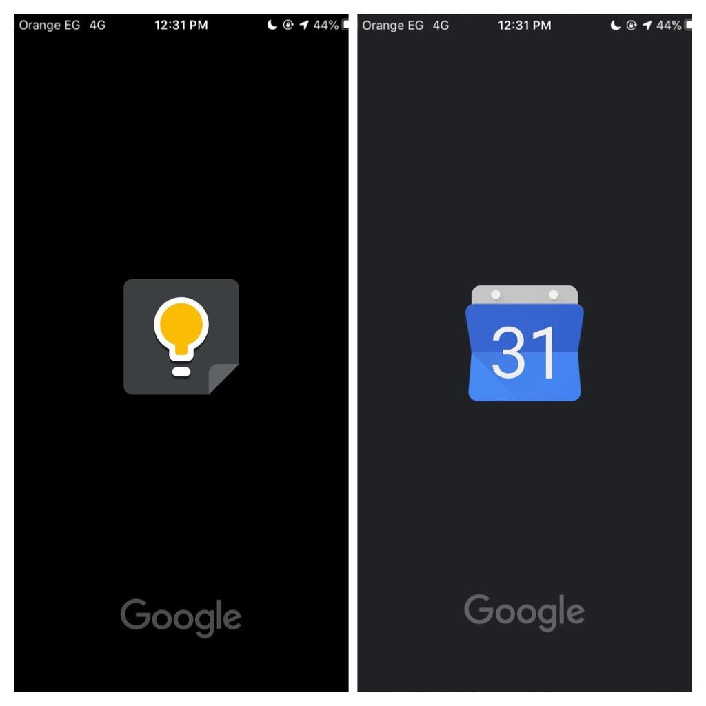
Once all of the above is achieved, make sure the app is tested in real conditions. Settings like automatic brightness, enhanced contrast, and low light must be tested thoroughly.
Our Thoughts
Dark Mode is relatively new in the market. We agree that some content does not really require Dark Mode but then this was created for those who want to reduce eye fatigue. A lot of the dark mode lovers use their devices at night and claim the benefits of this have been extremely useful. For those users, it can be a lifesaver over time.
Mobile apps like Facebook, Twitter, Youtube, and Whatsapp are considered as big brands. They have a huge traffic day in and day out. These brands are endorsing Dark Modes primarily because they have come across visible performance boosts with faster app launches, simple and user-friendly browsing and quick sign-ins. Further, Dark Mode is a great option to enhance user experience.
