Consciously or unconsciously, the majority of our everyday interactions with computers and the internet are contained under the umbrella of Microinteractions, in order to improve user experience.
Microinteraction is amongst the most innovative app and web design trends of 2020, these interactions primarily facilitate feedback from the users.
What are Microinteractions?
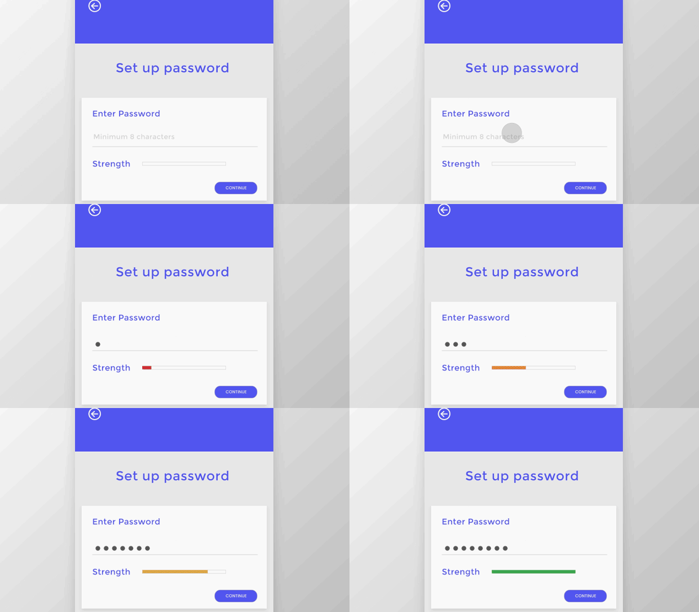
Primarily, microinteractions are a pair of trigger feedbacks that help Improve user experience. Here, the trigger could be a user action or an alteration in the system. The feedback you then receive is a narrowly targeted response to the trigger.
These responses are conveyed using small, visual, and contextual changes within the interface!
It is interesting to note that every trigger initiated by a user comprises a GUI command/voice-based command. Also, when a system starts a command, it is given that it’ll come with a set of well-defined conditions.
Whenever a microinteraction is triggered because of a command sent out by GUI, you will see a visual feedback element, placed close to the trigger.

How to improve user experience – When, Why, and How?
- Microinteractions are used when accomplishing a solo task
- They are used to connect devices
- Microinteractions are essential while interacting with a single piece of data
- It is vital for controlling specific ongoing processes like increasing and reducing the volume
- Microinteractions are used to adjust settings
- It is used to create content such as status messages
- They are used to turn on/off a feature to Improve user experience
- Microinteractions are used to give out instant feedbacks
- They are also used to encourage user interactions on a page, improve user experience without changing their focus.
How to improve user experience and enhance UX design?
Microinteractions have now become an integral part of UX design in order to Improve user experience. Why? Just think about it? Imagine you are on the Facebook app and the notification bell has zero interaction with you. No flickering, no bouncing of the bell – that would be so bland, don’t you think so?
Even when you are waiting for a site to load, you see the dots moving or the circle doing its rounds. It would be so dull to look at a screen with flat and insignificant symbols.
There is no denying that microinteractions have very successfully bridged the bland gaps that we thought never existed, and has drastically helped Improve user experience.

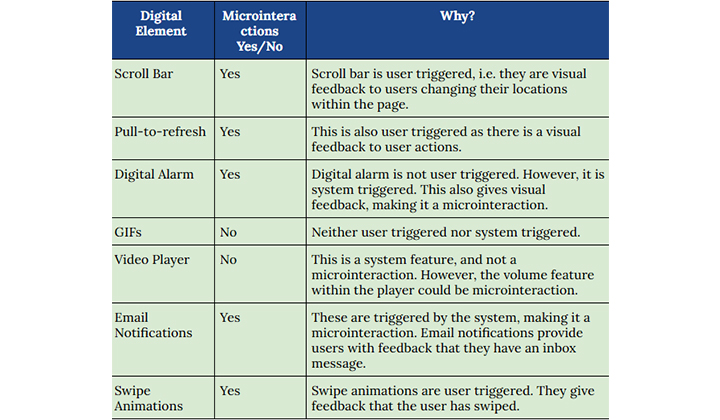
Microinteractions are made up of digital elements. However, not all digital elements are considered as microinteractions.
To be specific, the static elements that appear on your screen are not a part of microinteractions. They are not, primarily because they lack a distinct trigger. Also, the flows that are composed of more than one action are not considered to be microinteractions either.
Here’s a list of elements that can and cannot be considered as microinteractions, with reasons.

Dissecting Microinteractions
Every time a mobile app development company or a skilled and professional mobile app developer starts building an app, they should consider implementing the latest web design trends that are widely accepted and are popular amongst users, including Dark Mode!
Having said all that, it is also vital for the mobile app designer to be well versed in every aspect of microinteractions.
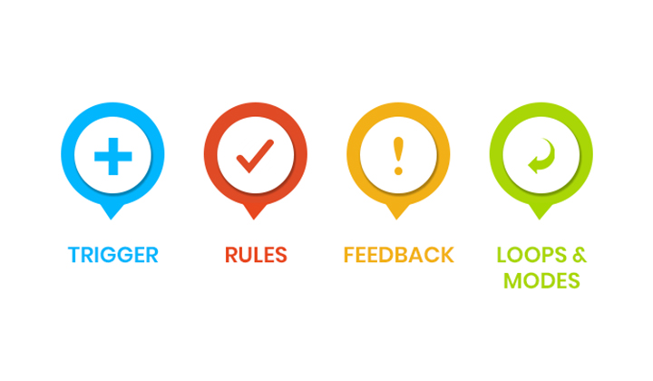
Microinteractions have four significant parts, in terms of UI design.
- Trigger
- Rules
- Feedback
- Loops

Trigger
The trigger is the first part of the entire process. Trigger motivates the user to scroll from screen to screen.
If not that, it prompts the user to pull refresh or perform any other GUI command. Triggers are either user-initiated, or the system initiates it.
Rules
Rules primarily are responsible for determining what is going to happen with the initial trigger (whether user-initiated or system initiated.)
Feedback
Feedback essentially gives out a visual, and audio-visual feedback or auditory clues on the screen. Feedbacks keeps track of all the activities that are on-going on the application.
Examples – Loading screens, color change on the screen, animations, and popups.
Loops
Loops and modes primarily determine what the meta-rules are. It is this that established the amount of time it will take for a required app action.
Loops and modes are also responsible for informing the users as to when they should move to the next task.
Why are Microinteractions Important?
Microinteraction is not confined to a better visual experience and an interactive display. They facilitate much more than just that.
Microinteractions are extensively beneficial when they are used to convey information regarding the status of the system, preventing support errors, and communicating with the brands. Over time, these functions teach a lot of value to brands.
System Status Display
It is important to remain transparent and let your users be informed about the present state of the system. This makes users feel empowered, and in return, they tend to engage more with your app.
The smallest amount of system status display is also considered to be a microinteraction primarily because it naturally has a trigger and feedback. Displaying system status is either action by the user or a change of system state.
Communicating your Brand
Have you noticed when you comment ‘congratulations’ on something over Facebook, the entire screen gets filled with balloons and confetti? Likewise, if your brand facilitates something fun and colorful of that sort, make sure you showcase it in your microinteractions.
It might be a good idea to consider making your animations and buttons colorful, fun, and engaging.
Wrapping Up
Microinteractions can be the key that essentially helps your product stand out from your competition. These microinteractions primarily give out feedback to the users, keeping them well informed, engrossed and engaged.
Microinteractions is one the most fascinating web design trends for the year 2020 and not having it incorporated in your app might actually be unfavorable for you. Good Luck!
Key Takeaways
- Microinteractions are primarily an action taking stimulus that prompts the user to take a specific action to continue using the app in order to Improve user experience.
- A microinteraction consists of four basic parts: Trigger, Rules, Feedback & Loops.
- Some common microinteractions are: Call to Actions, Animations, Swiping, Data Input, App Tutorials and Present System Status.
- Famous microinteraction design tools are: Xcode, Android Studio, Invision and Adobe CC.
